Payrolls Inc.: The Modernization of our Brand
Evolving the way users access and experience the Payrolls Inc. brand is key to our customers success.
Payrolls Inc. isn’t your average local business. As we move into over 45th year in business, our mission to innovate and accelerate our industry hasn’t changed. Several years ago, we created the, now ubiquitous, Payrolls Inc. Logo and Website, to better communicate our style and message that we’re a people company. With that in mind, we’re ecstatic to announce the fresh new look of Payrolls Inc..


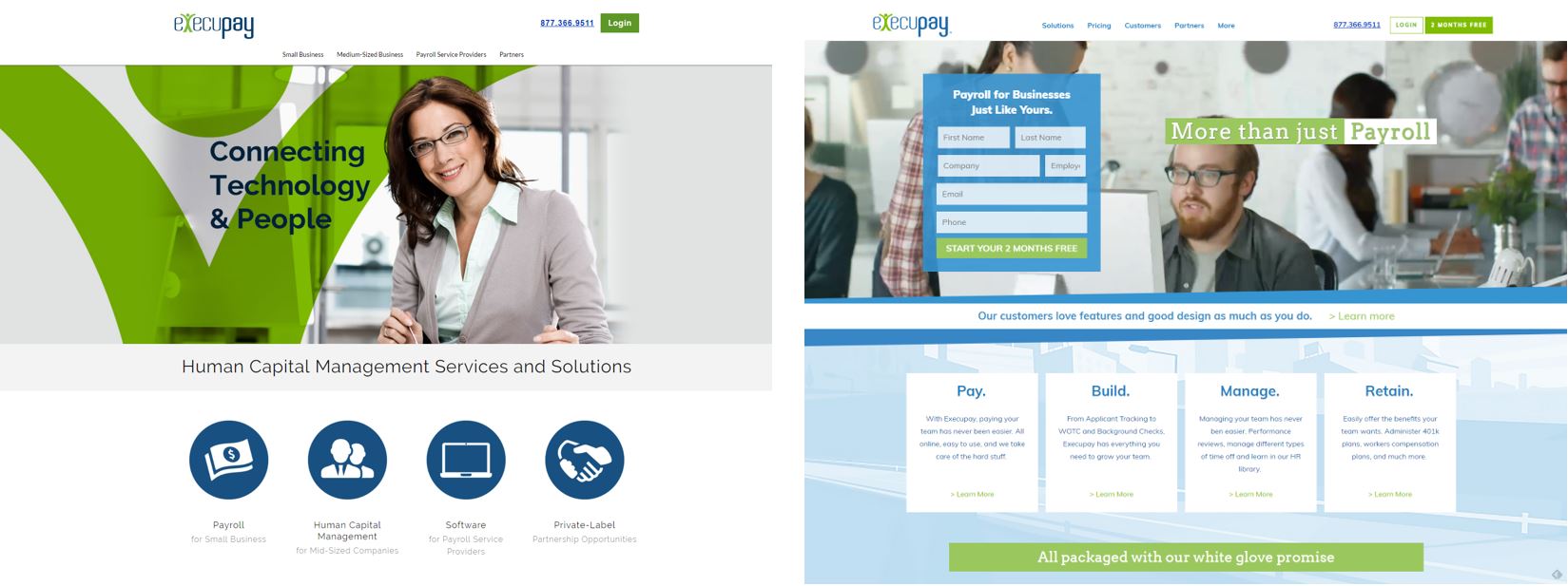
From the beginning, Payrolls Inc. has always been on the forefront of web design and making information quickly and easily accessible to our users, whether you’re trying to purchase Payroll for your small business, login to our existing services, or simply learn more about one of our platforms, we’ve always done our best to present all this and more, in one or two clicks. However, as our company, technology, and platforms our customers use move forward, we find the gameboard is changing and the way you engage with us is becoming more diverse. Existing and upcoming types of devices and ways to interact and communicate have emerged, with new ways to consume content, get in touch with us, schedule product demos, as well as preview our technology, and we’re working hard to embrace the opportunities that these new and amazing pieces of our world come together to continue to offer you the best experience possible.
We’re ready to give you a view of the design and marketing decisions we’ve made that reflect what our customers know and love about Payrolls Inc., but also push our brand to be as engaging and innovative as possible in this increasingly competitive and disruptive industry.
Creative Logo Thinking
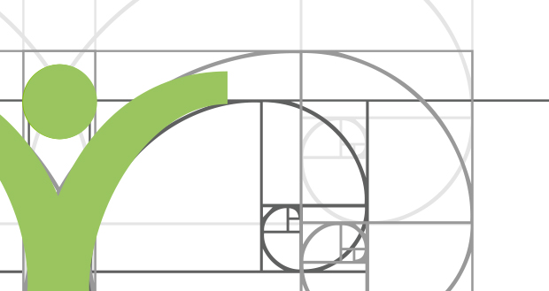
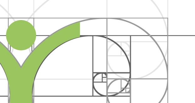
The Payrolls Inc. Logo has always had a friendly, people oriented approach. From our original “weebles”, to the 2014 evolution into “Execudude”, and now our fresh and modern material look, we wanted to communicate we’re a customer’s first company. We wanted to reimagine this with simple mathematical precision with an exceptional focus on simplicity and friendliness. We removed the hard edges on the typeface with more airy swoops. Execudude received a makeover to seem be more playful, friendly and less full bodied.


Every aspect of the new logo was tested to the point of exhaustion in various weights, sizes, colors, and spacing. Everything down to the location of the ® mark was placed for maximum viewing pleasure. Our brand guidelines were developed to protect our hard work with standards in everything from spacing, background types, various logo types (such as our “powered by” brand), and in any medium whether it’s digital or print.
Color Theory
We utilized Google’s Design concepts and it laid the foundation for creating a well-designed and functional rebrand, however we felt like we needed to think bigger and bolder about how Payrolls Inc.’s brand fit into the framework. We applied our personal brands identity to the guidelines, everything from color, iconography, imagery, typography, voice and motion. Not only did it bridge our brands uniqueness with the guidelines, it also fits the overall language of material design as originally intended.

Inspiration and Material Design Theory
We utilized Google’s Design concepts and it laid the foundation for creating a well-designed and functional rebrand, however we felt like we needed to think bigger and bolder about how Payrolls Inc.’s brand fit into the framework. We applied our personal brands identity to the guidelines, everything from color, iconography, imagery, typography, voice and motion. Not only did it bridge our brands uniqueness with the guidelines, it also fits the overall language of material design as originally intended.
Our Brand’s Voice and Message
We are the leader in Payroll and Human Resources with highly specialized expertise and best-in-class service across a full suite of business-critical services, offering every service you need to build, pay, manage, and retain your team, and grow your business with a team of always-ready, always-accountable, always-helpful always-human experts who embody our White Glove Promise. At its core, our voice is always human. Because that’s what we are, how we talk and who we talk to. And it doesn’t matter if it’s marketing copy, phone calls, emails or notes on the fridge (see how we said “fridge” and not “refrigerator?” Friendly, like that), Execupeeps talk to the world the way you want to be spoken to: with helpful words and phrases that are informative, simple, clear and easy to understand. But since we’re a Payroll and HR company, sometimes there’s only one right word or phrase, and it has more than two syllables. We avoid needless jargon, but in the right context, we don’t flinch from using words like WOTC or ACA Monitoring. And while our customers include some very technical folks who want simple descriptions for how something works or affects them, they don’t want anything dumbed down.
Product and Distribution
You’ll begin seeing our fresh look and feel pop-up everywhere over the next few weeks, however, you can witness our new design experience at execupay.com/wordpress, our blog, and in our newly released PlatinumPay Xpress software update. Our marketing, design, and product teams will be working with partners and developers to roll the latest look out everywhere over the coming months.
My, how far we’ve come.
Travis Bjorklund
Director of Marketing
Payrolls Inc., Inc.
LinkedIn
Sebastiaan Pleij
Visual and Web Design Lead
Payrolls Inc., Inc.
LinkedIn
Trackback from your site.